Our Work
Loughborough Orthodontics . Loughborough
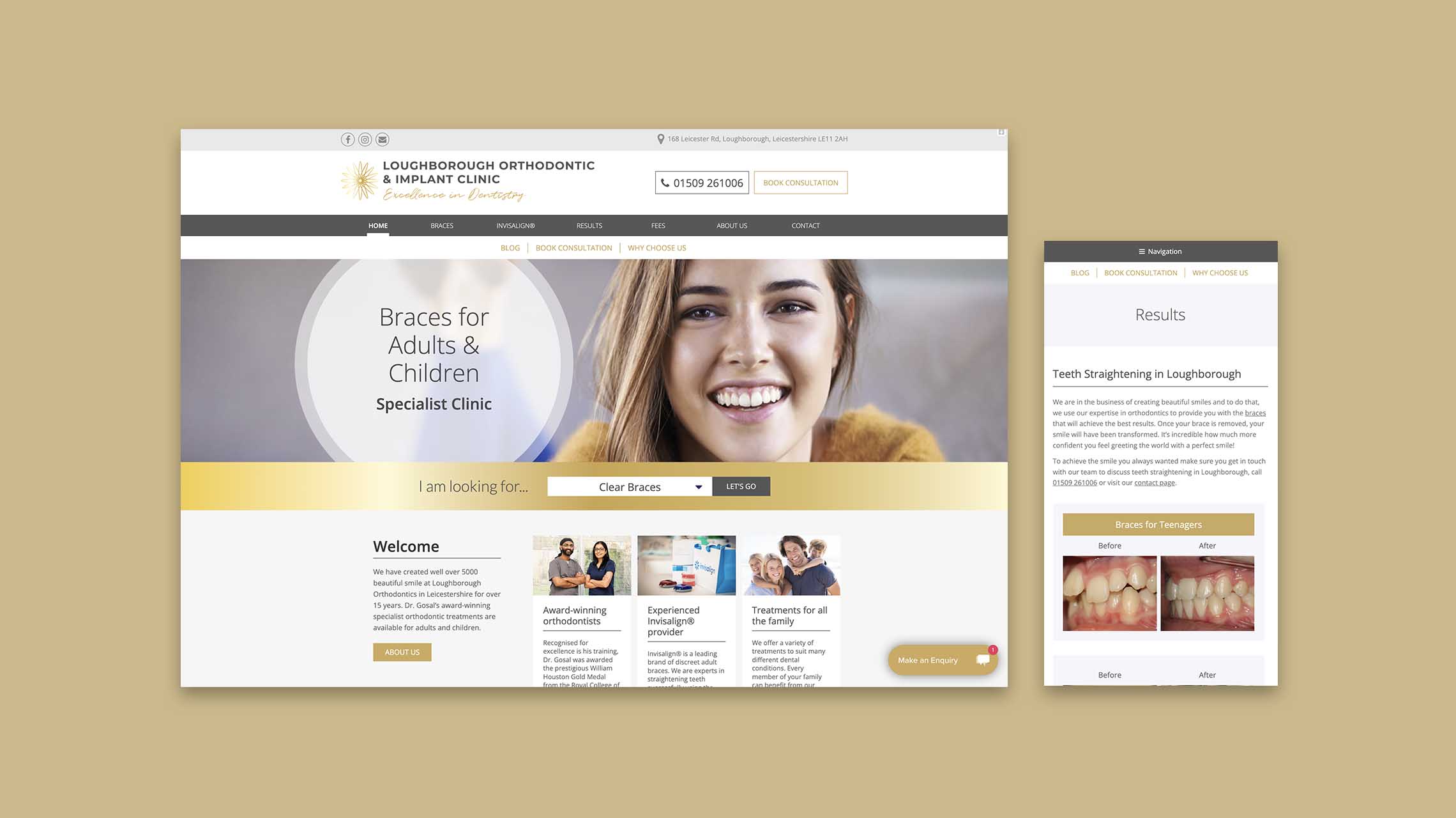
After a change of ownership, a new direction for the business was needed. A new logo, visual identity, website, and accompanying print marketing became our mission for the specialist orthodontic practice. We still needed to capture their business ethos and professionalism but bring a contemporary flare to the table.
We chose a colour set that blended together seamlessly yet eye-catchingly, creating a blue to purple gradient.
The home page welcomes you with maximised accessibility, placing a dropdown of ‘I am looking for’ right at the beginning to drive traffic to their treatment of interest. Before and afters, premises photography, and a direct call to action contact tab that tracks down the page as you scroll encourages enquiries and conversions.
Before and afters, premises photography, and a direct call to action contact tab that tracks down the page as you scroll encourages enquiries and conversions.