Deciding what should appear on your website’s Home page is often a challenge. After all, people may be coming into your website from different sources and with different enquiries. They might want to know about preventative dentistry, cosmetic dentistry or facial aesthetics, and so all have different needs. When your Home page has to offer different things to different people, how can you still create a coherent message about your business?
It’s helpful to view your Home page as the virtual shop window for your website and business. Like a bricks and mortar shop window, it needs to invite people in and show at a glance that what you offer will be able to meet their needs. It will probably attract the most traffic of all the pages on your website but, unlike treatment-specific pages, it won’t be built around driving people to complete a single action. Instead different elements will need to work alongside one another to take people on different routes into your website.
We think there are 10 essential elements that every Home page should feature:
1. A clear and simple headline
Stats show that you have just three seconds for your Home page to communicate what your website has to offer visitors. Create a headline that’s clear and simple, and states what it is you offer – this isn’t the time for fluffy, emotive messages. Make sure this main heading has an H1 tag too, so your offering is clear to search engines as well as to visitors.
You could try using slider/carousel images to feature different headlines for different audience groups. This gives each group a clear signpost about where to go next.
2. Strong subheadings
A subheading is a good way to add more information about how a person will benefit from becoming a customer/patient. You could try using your subheadings to focus in on your target audiences’ pain points or to show how you will make their lives better in some way.
For example, you could support a title like ‘Teeth whitening’ with ‘Make sure your smile is camera-ready on your big day’.
3. Calls to action
The purpose of your website’s Home page is to entice visitors deeper in your site, typically so they book an appointment and/or buy from you. When people visit your Home page, they may be at different stages in their customer journey. This may be the first time they’ve heard of your practice, in which case there needs to be an initial call to action that lets them learn more about specific services/treatments. On the other hand, they may be ready to book an appointment, therefore there should be a booking mechanism on your Home page.
Our advice is to feature two to three calls to action above the fold of your Home page, i.e. above the point where people have to scroll down to read more content, that reflect the different points in the customer journey.
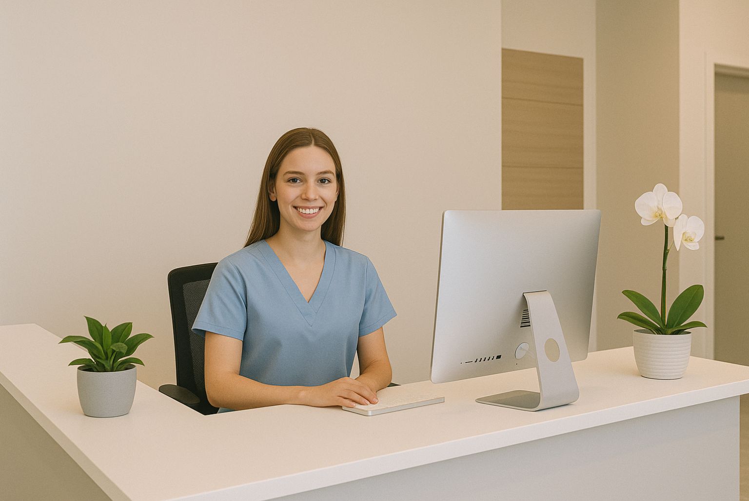
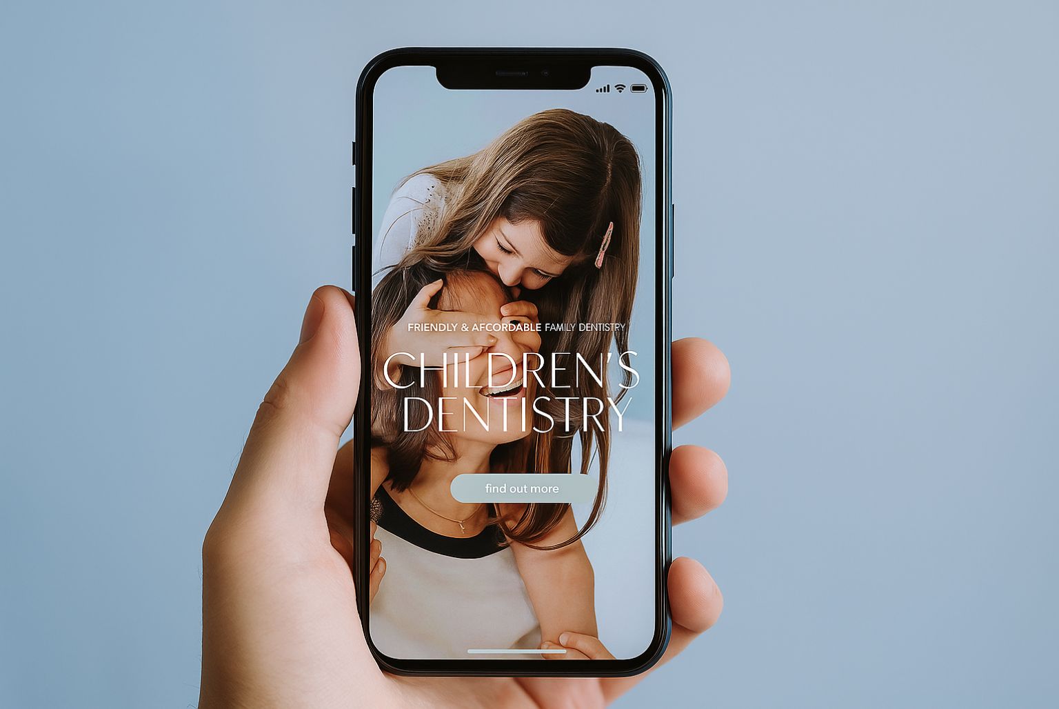
4. Carefully chosen images
They say a picture is worth a thousand words. Certainly, a well-chosen hero image or selection of images can help people to form an impression about your practice before they’ve read a single word on your Home page. Try to go for unique images that reflect the experience of visiting your clinic over stock images, if at all possible.
5. Clear navigation
To stop people bouncing straight away from your website, it’s essential to make the navigation as clear as possible. A bit like welcoming a guest to a party at your house for the first time, you need to greet them at the front door (your Home page) and then show them where everything is happening so they feel comfortable about where to go next.
Ideally, website visitors should be able to go anywhere they want on your website with a maximum of two clicks.
6. The benefits of joining your practice
Although you will need to keep the copy on your Home page light, explore ways that you can pull out the key benefits of becoming a patient and having a treatment at your practice. You might want to feature some bullet points, show logos of the professional bodies with which you’re affiliated, or highlight your affordable finance options. It’s essential to think about the things that matter to your patients. Why do people come to your practice? Why do they stay?
7. More information
Most people who arrive on your website won’t be ready to buy from you yet, so make sure that your Home page makes it clear that you provide more information about your treatments in other areas of the website. Having a section of your Home page that links to your most recent blog articles is another great way of showing that you have valuable content for your potential customers to access, build your authority and keep visitors on your site for longer, which are important ranking signals to Google.
8. Social proof
One of the biggest obstacles to buying from any company, particularly for the first time, is fear of the unknown. What if it’s not money well spent? What if you look like a fool for making a wrong decision? What if the treatment goes wrong?
By featuring social proof, such as genuine patient reviews, social media widgets, or a ‘Featured in…’ section if your practice has appeared in the press recently, you can help to show that other patients have made the decision to buy from you, to be treated at your practice, and are happy enough with their decision that they’re willing to tell other people about it.
Consider incorporating Google or Facebook reviews into your Home page in some way. People are often sceptical about reviews on websites – believing them to be handpicked by the company. Google or Facebook reviews are seen as more likely to be balanced.
9. Lead capture
One of the most common website mistakes is to let people click away from the site without capturing their details. If you can build a mailing list of warm leads who have expressed an interest in being contacted by you and finding out more about your services, it’s a lot less expensive than constantly trying to attract brand new traffic.
Consider adding some form of ‘irresistible freebie’ to your Home page with a short capture form. This might be a free ebook, white paper, video tutorial, treatment guide or something else altogether.
10. Awards & success indicators
If you run an award-winning clinic or have an award-winning practitioner on the team, your Home page is a good place to tell potential patients about it. Equally, if you belong to professional bodies or are involved in creating best practice in some way, this can be very reassuring to patients. You don’t need to use huge amounts of copy – just featuring the logos for your awards or your accreditations will give website visitors bags of information about your credentials.