The way people view websites is changing. As more of us turn to smartphones and mobile devices to organise our everyday lives, it’s only logical that more website traffic will come from these devices too.
In fact, 2014 is the first year that the number of visitors to your website via a mobile phone is almost equal to the number using their desktop to view your site.
At the beginning of the year, the Cisco 2014 Mobile Traffic Forecast predicted that mobile traffic would grow by 61% annually between now and 2018. In its simplest terms, this means that before long more people will view your website via a mobile device than on their desktop.
Even today, nearly half of all your new clients are using a mobile to find and view your site. But how easy are you making it for them?
Right now, you will find yourself in one of two scenarios. In scenario one, visitors can see your website on their mobile phone but have to zoom in and scroll about to read all the copy. Clicking on a ‘Read more’ button or pull down navigation menu can be fiddly and frustrating; they may not be able to see images in their entirety. Unless the person is really keen to know more about your company specifically, the chances are that they’ll hit the back button and pick the next option in the search results.
In this scenario, your website could literally be losing you 50% of your potential business.
Why responsive web design is essential
In scenario two, you already have a responsive website. What do we mean by responsive?
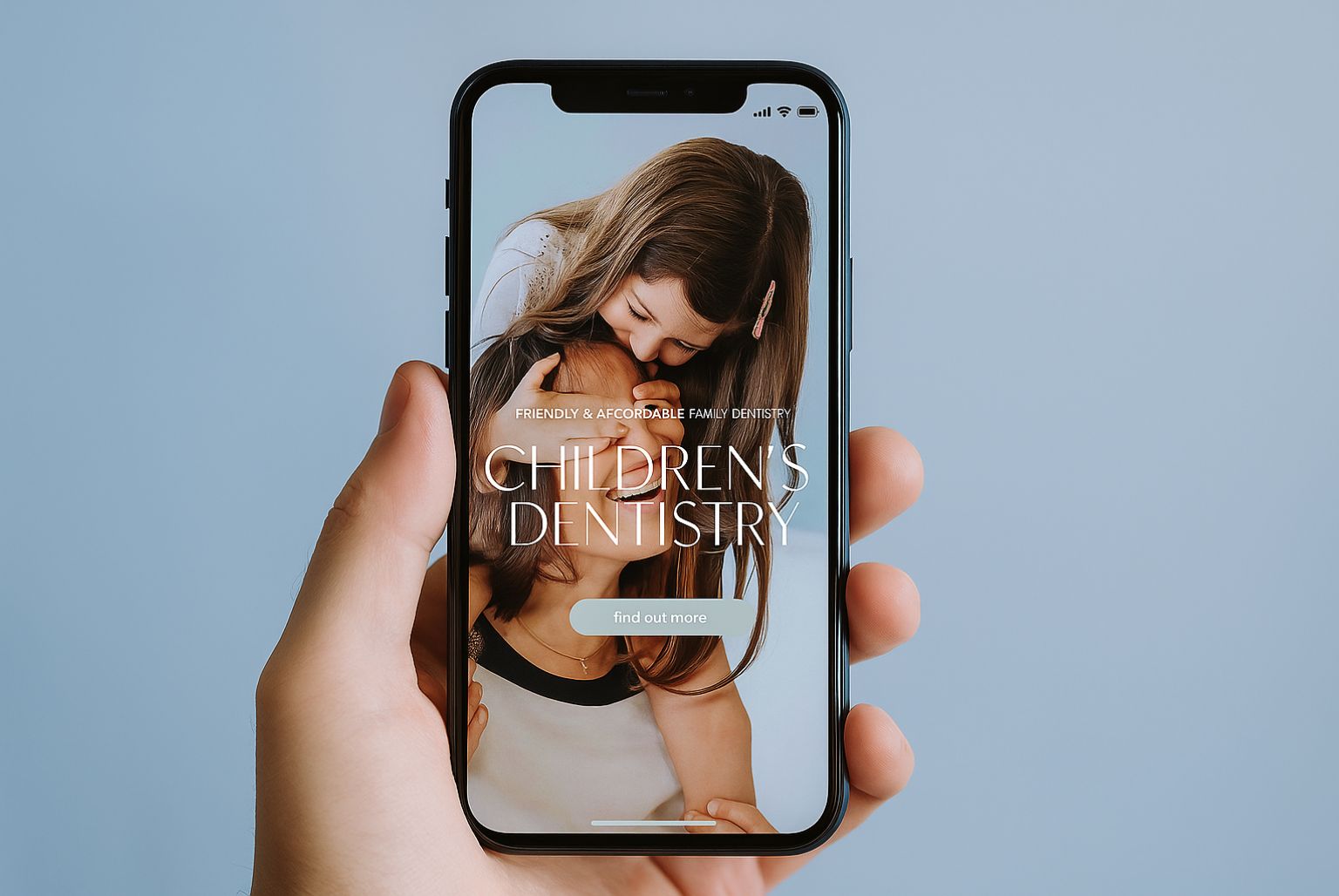
A responsive website is one that automatically detects what your web visitor is using to view your site – this might be a desktop, laptop, iPad, Android tablet, or mobile phone – and responds to this information by changing how it looks, its navigation and even what content is displayed.
With a responsive site, it’s easier for visitors to find out more about who you are and what you do. You can also guarantee that your customers will enjoy the same seamless experience of using your site, regardless of what device they’re using to view it. Call to action buttons, navigation options and internal links will all be accessible to mobile users.
Mobile devices change how we use websites
Research would suggest that we spend less time on websites when we use our mobile. This might be because we’re on the move, concerns about data usage, signal strength, or screen size. People often use their mobile phone to view a website when they have a query and want an immediate answer. This means that, as businesses, we need to present key information straightaway.
If you don’t have a responsive site, then you should expect a greater bounce rate and higher proportion of potential visitors to leave your website without clicking beyond the first page.
On the flipside, the more people get used to using their mobile to access websites and even make purchases, the more likely they are to use it to look for larger, more expensive or even more personal items. By making your website mobile-friendly and responsive, you can tap into this mindset.
A responsive case study
At H&P, we recently built a responsive website for Elanic, a surgical and non-surgical clinic in Glasgow. The desktop version of the site displays treatments in a logical and easy-to-follow way that includes a nice display of images that showcase the clinic’s modern interior and treatments.
On the iPad and mobile display, the images on the top navigation pull-down menus are replaced with plain text links. The images and text for the rest of the site is smaller to fit to the screen, and key information is prioritised.
The new website is attracting viewers from desktops and mobile devices. Most importantly, it’s keeping them on the site. People are taking time to read deeper and request a callback.
How a responsive website can boost your business
A responsive website is an investment, undoubtedly, but one that could help you reach out to the 50% of potential customers you may currently be alienating with your non-responsive website. That’s a lot of business.
Having a new responsive site does mean a rebuild. If you’re thinking about creating a new website today or you’ve been thinking that your existing site needs refreshing, make a responsive site a non-negotiable requirement. It’s even worth holding off for a couple of months to increase your budget to include a responsive design. Otherwise, you’ll be throwing good money after bad, and loosing new enquiries in the process.
If you have any questions about responsive website design or you’d like to know how it would help your business, we’d love to hear from you on 0115 914 0640.