Your website might look the part — clean layout, modern colours, smiling stock photos — but is it actually bringing in new patients?
In today’s competitive private dental market, first impressions matter. But they don’t pay the bills.
It’s tempting to invest in a website that looks sleek and modern, only to assume that’s the job done. But here’s the truth: a pretty dental website that doesn’t convert is just a digital ornament. If your site isn’t driving consistent enquiries, bookings, or calls, it’s time to ask the tough question — is it working hard enough for your business?
A Good-Looking Website Isn’t Enough in 2025
Let’s be honest — dental clinic websites are starting to look remarkably similar. Clean white backgrounds, pastel highlights, smiling faces, scrolling testimonials… it’s the standard now. Which means that standing out — and converting visitors into leads — requires more than surface-level polish.
Design is just the beginning.
A high-performing dental website in 2025 should be:
- Built for mobile first, since more than 70% of dental website traffic comes from mobile devices
- Fast-loading, ideally under 3 seconds
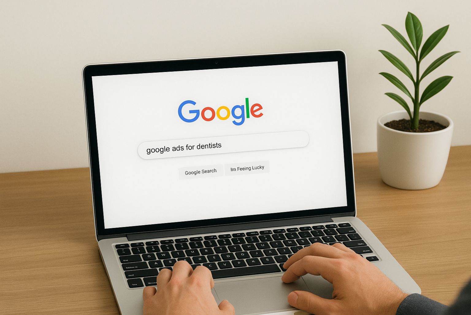
- Optimised for local SEO, so it appears when people Google “Invisalign near me” or “private dentist in [city]”
- Designed with conversion paths, including CTAs, lead magnets, and online booking functionality
- Easy to navigate, especially for older audiences or anxious patients
It should also give visitors a reason to trust you within seconds. Why? Because most users bounce within 10–20 seconds if they don’t see what they’re looking for.
Is Your Website Creating Confidence — or Causing Confusion?
Imagine a prospective patient lands on your site. They might be nervous, time-poor, or unsure if private treatment is worth the cost.
What do they see?
- Do you clearly highlight who you help and how?
- Can they easily find pricing or finance options?
- Is it obvious what to do next — call, book online, or submit a form?
If the answer to any of these is “not really,” you’re likely losing warm leads every day.
A confident, user-focused website does more than look good — it removes friction. It guides someone gently from interest to action, reducing doubts along the way. Whether it’s nervous patients looking for sedation options or busy professionals needing weekend appointments, your site needs to address their concerns without them having to dig.
Common Mistakes That Hurt Your Conversion Rate
Here’s what we frequently spot during website audits for dental clients:
- Generic homepage copy: If your homepage could belong to any clinic, it’s not helping you stand out.
- Buried calls-to-action: Users shouldn’t have to scroll or guess to find your “Book Now” button.
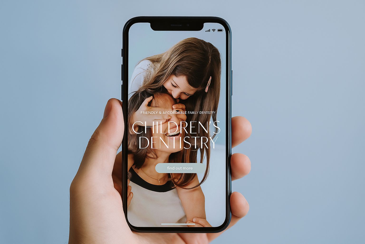
- Overuse of stock photos: Real imagery of your team and practice builds trust far more effectively.
- Lack of online booking options: Modern users want instant action — don’t make them call if they don’t have to.
- No performance tracking: If you can’t tell where your leads are coming from, how can you scale your marketing?
The good news? These issues are often easy to fix once you know where to look.
What High-Converting Dental Websites Do Differently
Top-performing dental websites don’t just look better — they work better. Here’s what they typically have in common:
1. Benefit-Led Messaging
- Instead of “We provide cosmetic dentistry,” say “Achieve the smile you’ve always wanted in as little as 6 weeks.”
- Speak to the outcome, not just the service.
2. Clear, Repeated CTAs
- Every key page — from Invisalign to root canals — should make it easy to book or enquire.
- Use buttons like “Check Availability” or “Request Your Consultation” instead of generic links.
3. Trust Signals at Every Turn
- Google reviews, before-and-after images, GDC registration, and CQC compliance badges all build credibility.
- Testimonials are great, but video testimonials are even better.
4. Fast, Mobile-Friendly Performance
- Your site should load quickly, adjust to all screen sizes, and work smoothly on every device.
- Remember: speed = trust.
5. Smart Structure and Internal Linking
- Pages should lead naturally into each other — e.g. from a blog on teeth whitening myths to your whitening treatment page.
Not Just the Homepage: Every Page Should Convert
Many clinics pour all their focus into the homepage, forgetting that Google might drop users straight onto a service page or blog. If those pages aren’t optimised, you’re missing huge opportunities.
Take your Invisalign page. Is it:
- Using patient-friendly language?
- Showing real results?
- Highlighting payment plans?
- Linking to FAQs or related treatments?
- Offering a next step?
If not, even targeted traffic may slip away.
Pro tip: Add a CTA halfway down your longer pages. Users don’t always scroll to the bottom — meet them where they are.
Real Results: What Happens When You Get It Right
We’ve seen it time and time again. A clinic upgrades their website not just in design, but in strategy — and the impact is immediate:
- Enquiries double within weeks
- Google Ads performance improves because landing pages convert better
- Time-on-site increases and bounce rate drops
- Clinic teams report “patients saying they found us easily and liked the website”
It’s not magic. It’s a strategic design, done well.
Still Unsure If Your Website Is Holding You Back? Here’s How to Tell
Ask yourself these questions:
- Are you getting traffic, but few leads?
- Do people mention your website when they enquire — or never bring it up?
- Are your competitors’ sites more engaging, faster, or easier to use?
- Have you looked at your site on mobile recently?
If the answers leave you with doubts, a fresh perspective could make all the difference.
Your Website Should Be Your Hardest-Working Team Member
Think about it: your site is working 24/7. It never takes breaks, never calls in sick, and greets every single patient before your receptionist does.
So why settle for average?
At Cosmetic Digital, we build websites that combine expert design with the kind of strategic thinking that turns browsers into bookings. We’re not here to sell you a redesign unless it’s necessary — sometimes, small changes deliver big results.