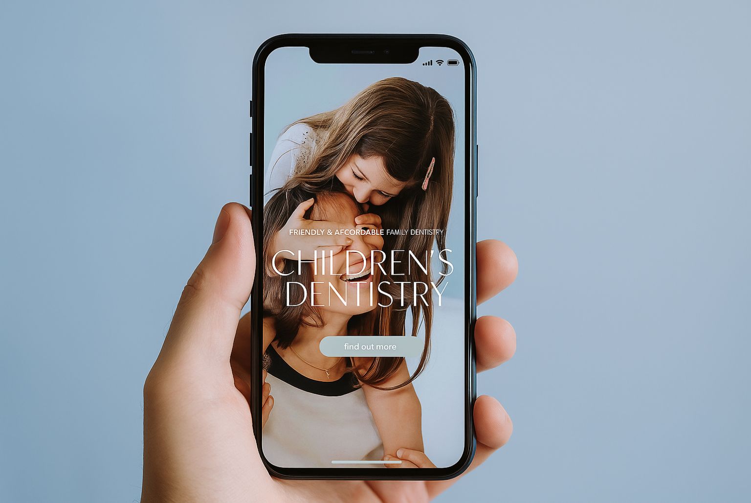
You may have heard about mobile responsive websites already. They are websites that are built to automatically respond and re-size when being viewed on different devices like a smart phone or tablet such as an iPad. (Technically it’s the devices resolution that the website is adapting too.)
Then there are the separate mobile websites. The difference here is that a separate mobile website is exactly that. It is an often smaller, separate version of your main website designed for mobile phone users.
Like with all options, some are better suited for your business than others. However with technology growing as fast as it is, you need to be preparing for the long-term challenges awaiting you. The sooner you are prepared, the better the edge you have over your competitors.
My aim in this short article is to give you straight forward honest advice when it comes to choosing which path you want to go down, and there are many factors that will affect your decision.
1. Convenience
Convenience is a huge business, and not many people take advantage of it.
70% of mobile searches lead to action on websites within one hour. That’s assuming that the website is mobile-friendly, otherwise 40% will choose another result.
Converting enquiries has a lot to do with how satisfied customers are, this is how you build a reputation for your brand and grow.
Don’t make the mistake of leaving it too long to make your website responsive and giving away potential clients to your competitors.
2. One size fits all
Many businesses realised the need to cater to mobile customers. Having a mobile version is far better than not having anything at all. A lot of these sites will have on them mobile or full version links.
One of the main disadvantages is that the mobile version can often get forgotten about. Changes to your main website will need to be made to your mobile version also, this is especially true of offers and old prices that may no longer be valid.
A responsive website naturally means one set of updates and changes with less maintenance than making changes and paying twice for the same updates. Also a lot of mobile sites rarely have content management systems on so most of you wont have access to change your own mobile site.
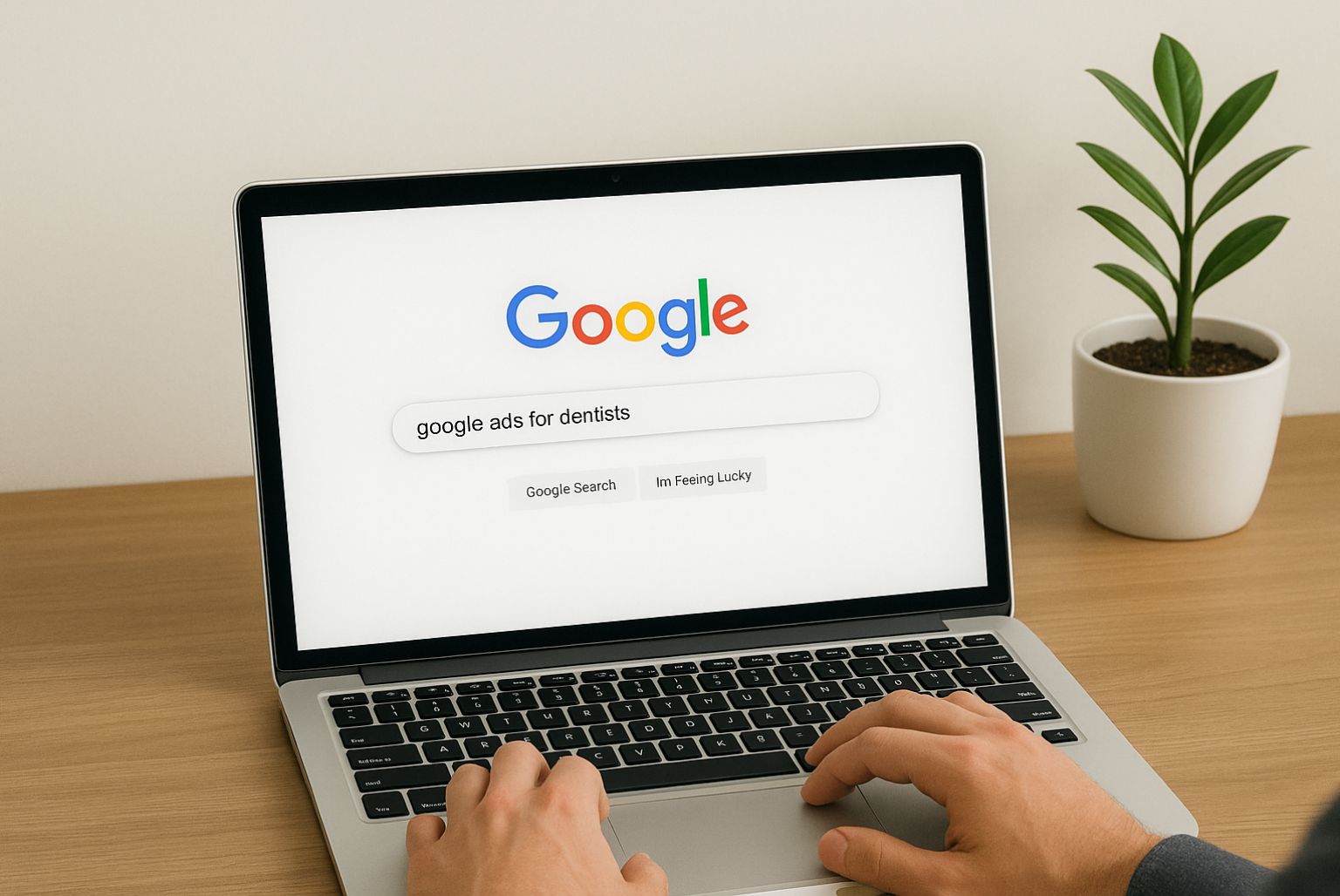
3. Increase your Google ranking
Google supports both separate mobile friendly websites and mobile responsive websites, however they recommend having a mobile responsive website.
In short, mobile responsive websites are easier for Google to find, there is only one URL to look for and makes it faster to locate and load it.
With a mobile responsive design, there is no need to be re-directed which can ultimately put off your potential new client.
But it does more than that – as web designers we are able to decide what content is shown on your website when its displayed on a mobile. People on mobiles normally want the information faster compared to being on a desktop. So we ensure the main points are covered when being shown on a mobile and not everything else that may increase the download time.
Even though 4G is widely used most people are still on 3G with their phones because of costs and phone contracts. This means that your website is ultimately taking longer to load which causes clients to either leave after a few pages or more seriously, straight away. It’s this, which is called bouncing. And the more people that leave straight away the higher your ‘bounce rate’ is. And for those of you keeping up with me – Google reduce your page rankings if you have high bounce rates as it sees this as your website isn’t liked much.
4. Helping your competition
“61% of mobile users will not return to a website that they have had trouble viewing or using. 40% of those users will then go onto a competitor’s website that offers better usability.”
If your website is not optimised correctly for mobile phones and tablets, this is a sure fire way to deter clients. If the mobile version is re-directing them, this will take time. No one wants to spend ages trying to find info especially when they will be having to zoom in just to see your navigation. They just get fed up and leave.
5. Save money and make money
Those who already have a mobile responsive website will know that while it may have cost a bit more to invest in hiring an expert developer, they have saved a huge cost in the long run.
It will save you the hassle of having to maintain two separate websites, and thus save you the maintenance costs of having to pay someone to make changes to both websites every month and every time you want to make updates.
Ultimately if nearly half or more than half of all your web traffic is mobile or tablet using then this means more enquiries, which means more business.
These are just a few of the main reasons why having a responsive website will work for your business.
Read more at http://www.handpdesign.co.uk/web-design/responsive-web-design.php
If you would like to know more about how we can support you with this process, you can call us on 0115 914 0640 or email enquiry@cosmeticdigital.co.uk.