Web design and content is constantly evolving based on the behaviours of web users and the devices they’re using to get online. What worked for your website a couple of years ago may not be right for today, so we’d always recommend viewing your clinic website as an organic, ever-changing presence rather than a static object.
If you feel like your current website needs some TLC, we’ve put together our list of ten actionable ways that you can improve your website and convert more visitors to patients:
1. Ask for feedback
Because you’re so close to your practice and may have been very involved in creating the current incarnation of your website, it can be hard to see it through fresh eyes. If you have a marketing mailing list for your patients, why not try sending out a free survey using a tool like Survey Monkey to ask what they think of your website? You could always offer a free prize like an Amazon voucher as an incentive and there are some great free programmes online to help you decide the winner at random.
Questions to ask in your survey could include:
- Is it easy to navigate?
- Did they find the information they were looking for?
- What did they like about the site?
- What did they dislike?
Feedback from your patients may help you pinpoint areas of the website that are turning people off or highlight what you’re doing well.
2. Create patient personas
A helpful marketing tool is to create a ‘persona’ for your ideal patient. You could base this on some of your existing patients. Who are the people who come into your practice and really value the services that you offer? Who recommends you to their friends and family? Do they all fit into a similar age group and background? What common ground do they share?
This knowledge about your ideal patients will help you create a patient persona. Now look at your website through their eyes. Will the images appeal to your target patients? Does the copy speak to them? Are you promoting the treatments that they will be most interested in?
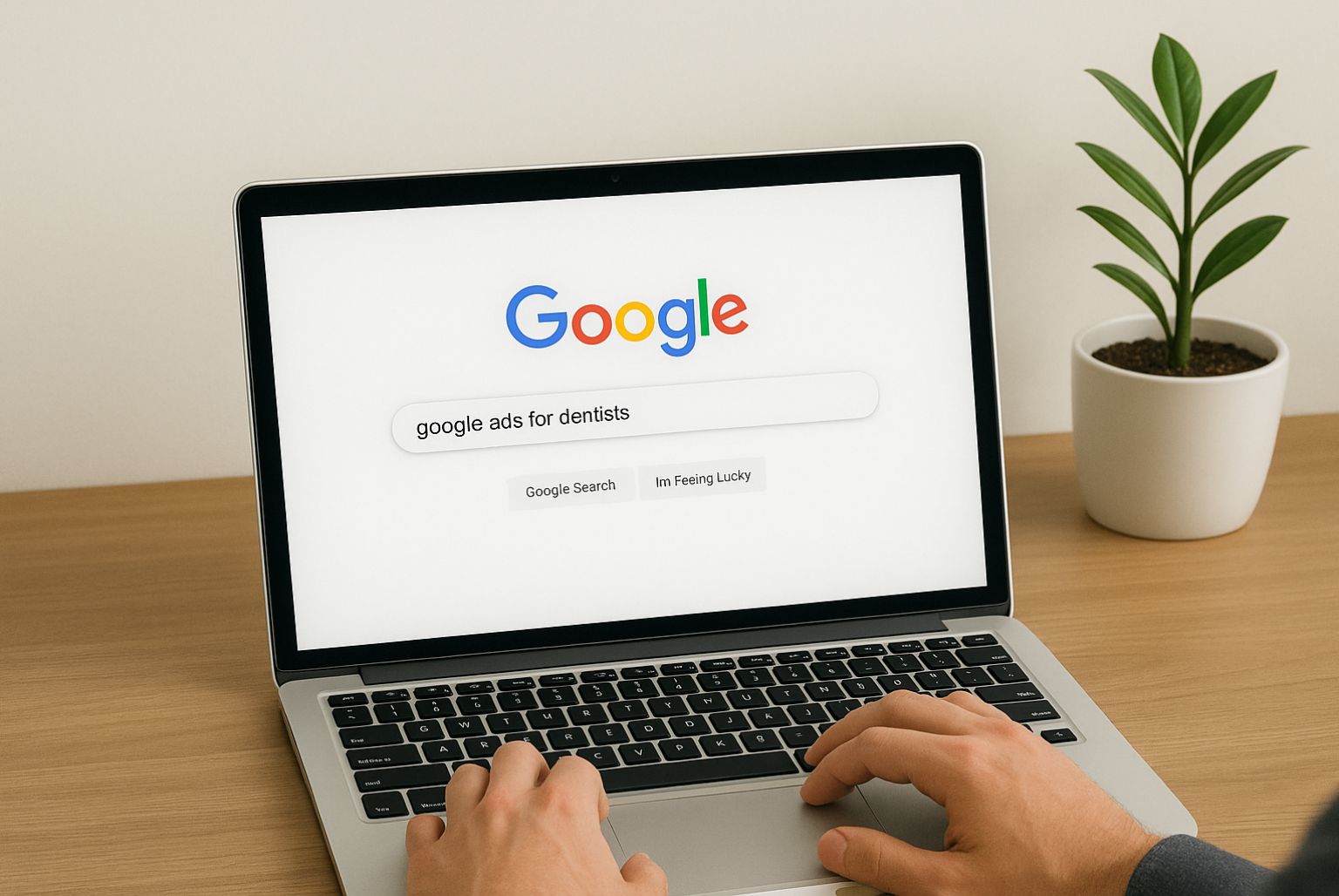
3. Check your headlines
As we mentioned in our recent blog about attracting more visitors to your clinic website, headlines matter. When we look at hot spots on the screen, people always look to the top left of a web page first where the headline sits.
Each page of your website should have a unique headline that reflects what the page is about. If you use landing pages on your website to promote a specific campaign, such as teeth whitening or Invisalign braces, you should make sure that the heading on these pages mirrors the heading of the ad or user search that brought the person to that page.
4. Move the most important information above the fold
The ‘fold’ is the point on a computer screen where visitors will have to scroll down if they want to read what sits below it. As many people don’t bother scrolling down the page, you should try to have the crucial information that you really want them to see above the fold, so that it’s viewable at a glance.
5. Change your call to action
One of the biggest mistakes people make on business websites is neglecting to include a call to action on every page. Website visitors appreciate a clear call to action because it tells them what they need to do next. Without it, they may just navigate away from your website to one that gives them a clearer pathway through the content.
Do all of your pages have a call to action? If not, adding one could make a big difference to your conversion rates.
How you word your call to action is important too. All too often, businesses try to secure subscriptions to their mailing lists with a general ‘Subscribe’ button. This isn’t likely to convert.
The most powerful calls to action are those that tell the customer what’s in it for them. Why should they give out their email address? What are the benefits? What will they get in exchange? If you’re currently asking people to ‘Subscribe’ to your newsletter, try a call to action along these lines: ‘Email me the latest news, advice & announcements’ or ‘Get our latest content first’.
If you offer a free download on your website, such as a guide to teeth straightening or skin health, then try incorporating the benefits of the download in your call to action. For example:
Enjoy the results of your treatment for longer
Download our FREE guide to keeping your skin healthy, fresh and youthful, and enjoy the amazing results of your treatment for even longer.
SEND ME MY FREE SKIN HEALTH GUIDE NOW
You should also consider the design of your call to action. Does it stand out on the page? Move distractions away and create some space around the call to action to help it be seen.
6. Lose the ‘we’
Many businesses make the mistake of talking about themselves too much in their copy. After all, they want to let potential patients know what they can do. In fact, your copy is much more likely to convert if you lose the ‘we’ and talk to ‘you’, the reader.
Potential patients do want to know what you can do but only in the context of how it will benefit them. Go through your copy and change ‘we’ to ‘you’ – your patients will thank you for it.
7. Look at your website on different devices
With more than 50% of us now viewing the internet from our smartphones and tablets, it’s never been more important to create a consistent experience of your website across all devices.
Take some time out of your day to visit your website via your desktop, laptop, tablet and mobile phone.
- Does it run smoothly?
- Does the content load quickly?
- Does everything display properly?
- Are there any glitches that need fixing?
- Are the call to action buttons big enough?
- Are forms easy to fill in regardless of the device?
If there are areas of the website that need improving to work well on a range of devices, then this gives you some action points for what needs to change.
8. Add relevant testimonials to build trust
Instead of, or as well as, featuring all of your patient testimonials on one page, it’s a good idea to highlight testimonials that are relevant to a particular treatment on the page of the treatment it relates to. If someone has praised the results of their orthodontic treatment or wrinkle reduction injections, their words should sit alongside the treatment information. This will help to build trust as potential patients put themselves in the shoes of someone who has had the treatment and seen great results.
9. Add FAQs
There’s a reason that more and more clinics are adding frequently asked questions to their websites. This is a great way of saving patients time by answering the most common questions up front.
When people search using mobile phones, they are also more likely to ask a question like ‘What is Soprano laser hair removal?’ than type a group of keywords like ‘Soprano hair removal Nottingham’. FAQs not only meet your patients’ needs to know more about a treatment but fit well with how people use Google, which is great for boosting your rankings in search engine results pages (SERPs).
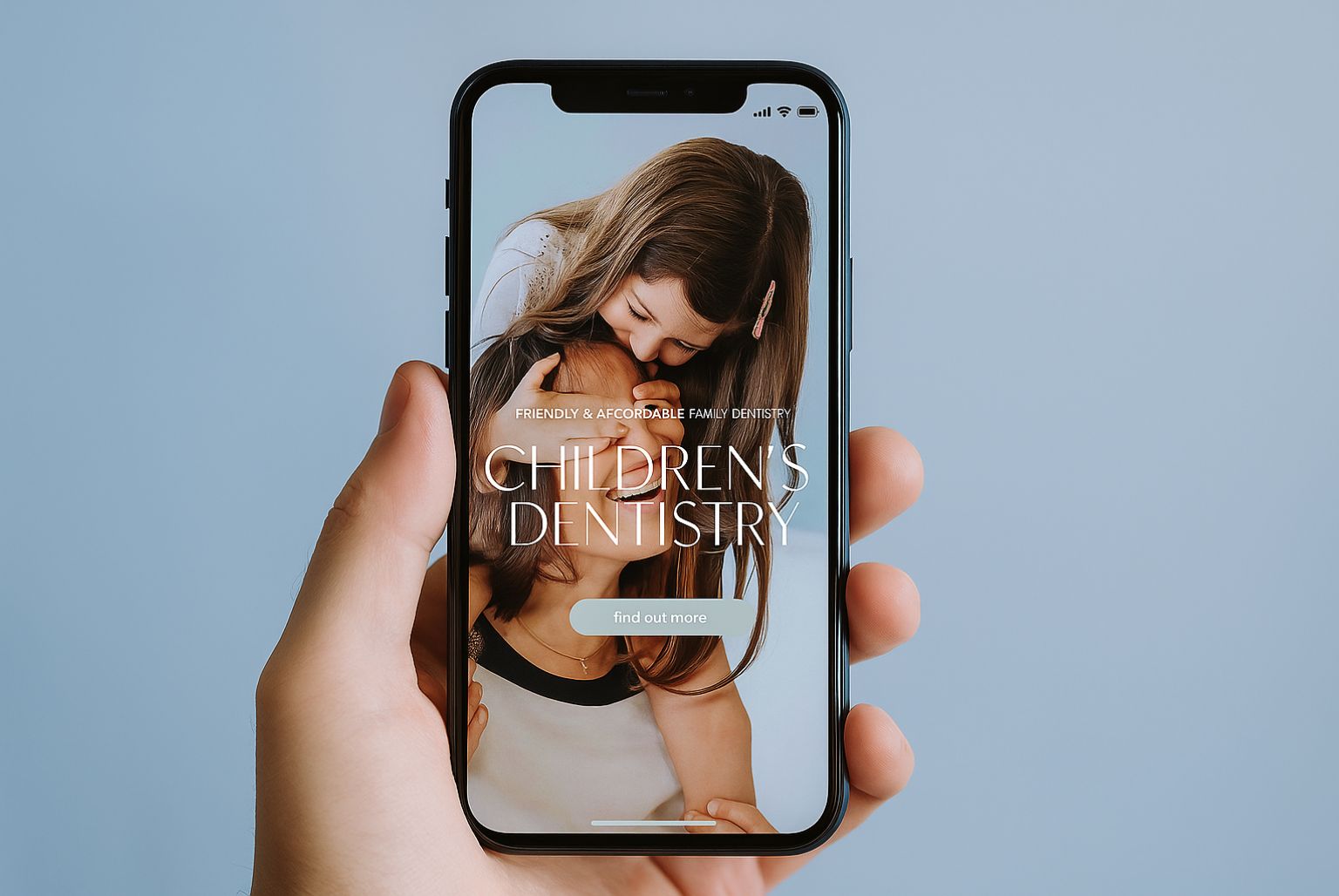
10. Use real photos, not corny stock photos
One of the purposes of your website is to help people feel like they know your clinic before they even step through the door. High quality images of your treatment rooms, waiting area, reception, and staff going about their day will help create a sense of familiarity, whereas corny stock photos can jar with website visitors as they don’t seem authentic.
If you do need to use stock photos to pad out your website, there are some high quality images available – it’s just a case of taking your time to look for undiscovered gems, or using an agency that knows where to look.